Let There Be Light by Linda Dixon, at the Pennsylvania National Quilt Extravaganza XX. Photo by Wayne Stratz.
When Stratoz and I went to the Pennsylvania National Quilt Extravaganza XX, this quilt was one of the first to catch my eye. When I looked up Linda Dixon, I discovered a post on her blog where she describes being inspired by a mosaic dome at the Basilica of the National Shrine of the Immaculate Conception in Washington, DC.
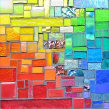
Mosaic Dome at the National Shrine of the Immaculate Conception, Washington, DC. From IntangibleArts on Flickr.
I have often been energized by quilt designs in my mosaics, so it was very cool to discover a quilter inspired by a mosaic.
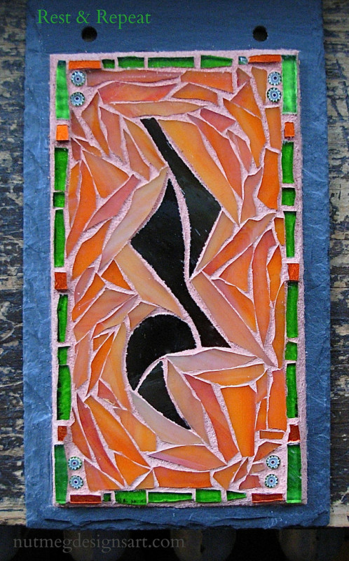
Rest Sign with Repeats by Nutmeg Designs, glass, gold smalti, and millefiori on slate, 4×7 inches.
Our client saw the first quarter note rest Stratoz and I created last summer, and was inspired to commission one for her daughter and new son-in-law. They are both musicians and Sandra wanted to give them a sign to greet them in their comings and goings: Rest and Repeat. Fortuitously, she requested orange, brown and green, which look wonderful together.
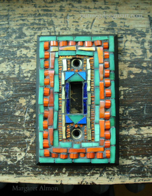
Mosaic Switchplate in Green, Orange and Gold, by Margaret Almon. Glass, gold smalti, dichroic, millefiori on cast brass, 2.75×4.75 inches.
Two different people asked me if I made mosaic switchplates, during the same week. When I looked at the plate, with it’s holes for the screws and the toggle, I didn’t know how to begin. While mulling possibilities, I remembered Laurel Skye’s book Mosaic Renaissance, where she describes many projects using millefiori, the flower rounds made of glass cane and sliced so the blooms appear. Laurel Skye creates tapestries of glass, with millefiori in a multitude of forms. If you cut the rounds in half a new configuration is revealed, both on the face of the millefiori, and with the effect of being laid down with the round side up. Imagining the light switch cover as a tapestry or a miniature magic carpet helped me to work with the layout of the plate. For other millefiori inspired pieces, and a video about the making of millefiori, check out my post M is for Millefiori
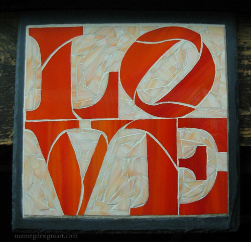
Love Mosaic commissioned by a client who digs orange, by Nutmeg Designs. Stained Glass on slate, 12×12 inches.
The client came over to pick up her mosaic, and was very happy, which makes me happy! The Love sign is a motif in her home. Stratoz had done his studying of the font, choosing cut-lines, cutting, grinding and gluing down the pieces of LOVE. I was then faced with how to flow around these formidable letters. Working with Robert Indiana’s configuration at close range made me appreciate the shapes emerging from the spaces, particularly the arrow formed between the L and the V, and his tilted O is awesome. Stratoz lined up the grain of the stained glass streaks to tilt as well.
I was reminded of Home Ec class, and learning to find the grain of woven fabric and aligning the pattern pieces to allow a skirt to hang straight, or placing pieces that on the diagonal, to make bias tape, which gives into the stretchiness of the angles. The root of the word bias means “slant, slope or oblique,” and the O is caught just as it begins to roll. Letters are expressive in their shapes, and we absorb their delight as we are reading.
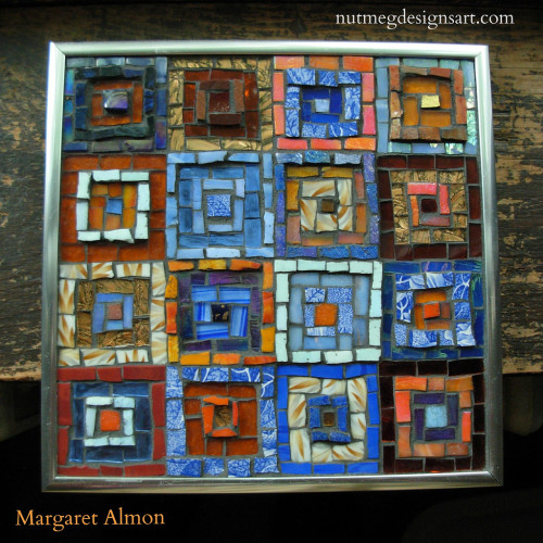
Around the Square by Margaret Almon. Glass, china, mirror, smalti on wood, 8 inch.
Quiltmaker’s Color Workshop by Weeks Ringle and Bill Kerr could have been called Mosaicmaker’s Color Workshop. This book propelled me into the studio to experiment with squares, and observe how different elements receded or advanced toward my eye. These are all squares within squares, but a pale square pops out in a dark background, an orange square vibrates against a blue one.
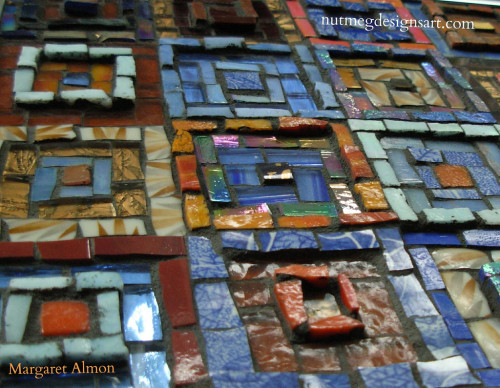
Topographic Detail of Around the Square mosaic by Margaret Almon.
Mosaic added another element to play with: topography. Unless something requires a flat surface to function, I am not a “run your hand over it perfectly smooth” mosaicist. I like levels with some pieces standing proud, and others retreating into quiet.
Like a memory quilt incorporates fabric from someone we love, I incorporated some broken pieces from my great grandmother Margaret’s china. My mother had given me the pieces, heartened by the possibility that I can create something with them. I was named for my great grandmother. I keep this mosaic on my studio wall.
Orsoni Gold smalti in orange. Photo by Margaret Almon.
The cartellina is a veil of blown glass which protects the gold leaf laid on a glass chunk, making a delicate sandwich. The cartellina, overlaying each of these pieces from the Orsoni Foundry, is variegated from yellow to red orange, like flame. Incorporate is the first word that comes to me when I contemplate using gold smalti in my work: unite into one body.
Fire Spiral Mandala by Margaret Almon. Glass, gold smalti, dichroic on slate, 7 inches.
Orange stained glass is awesome, and having a reason to buy more is even more so. This commission is from a client who digs orange as much as I do. Stratoz cut the letters out and now it will resonate in my studio until I create the background.
Flight of the Butterfly No. 1 by Stanton Macdonald-Wright(1955), North Carolina Museum of Art. Photo by Wayne Stratz.
I grew up in Canada, and prefer going north in the summer, but Stratoz and I made a rare venture south for vacation. We discovered the North Carolina Museum of Art in Raleigh, which reveals more delight around each partial wall, a maze to enjoy rather than get lost in. The painting Flight of the Butterfly No. 1 by Stanton Macdonald-Wright caught my eye right away with the blocks of color and the spiral shape. To see the whole painting, plus more of the collection, check out Amy Looks Closer: North Carolina Museum of Art.
Stanton Macdonald-Wright, 1948 / Robert Bruce Inverarity, photographer. Robert Bruce Inverarity papers, Archives of American Art, Smithsonian Institution.
Macdonald-Wright named his painting style Synchromism “with color” as Symphony is “with sound,” and envisioned color as akin to music, not needing to be tethered to a literal interpretation of the world. He imagined a scale of colors, which could be orchestrated like musical notes. Often there was a central vortex out of which the other colors arose. The orange in the center of Flight of the Butterfly is bursting with sound against the blue-violet. I make mosaic spirals and something about Macdonald-Wright’s unwinding center resonates.
The American Magazine 1928 with a Philo Vance story by S.S.Van Dine(pen name of Willard Huntington Wright)
Macdonald-Wright was given his first name, Stanton, in honor of women’s rights activist Elizabeth Cady Stanton, and he hyphenated his middle and last names to avoid the constant question of whether he was related to Frank Lloyd Wright. His older brother, Willard Huntington Wright, wrote the Philo Vance detective novels under the pen name S. S. Van Dine.


")