Werner Drewes Christmas card, 1971. Werner Drewes papers, Archives of American Art, Smithsonian Institution.
My Pinterest path crossed with the Archives of American Art’s Pinboards, commenting upon my Margarets Board, and what fun that was! The About page has a quote that sums it up: “…a repository of inestimable value, like the art world’s Fort Knox.”– contemporary art collector and friend of the Archives. And I didn’t even know it existed! To think I was a librarian!
Werner and Maria Drewes Christmas card to unidentified recipient, 1977. Werner Drewes papers, Archives of American Art, Smithsonian Institution.
This Werner Drewes Christmas card, 1971, and Gloria in Excelsis Deo Card, 1977, are part of the collection of the Archives of American Art and just two of over 16 million items in their collection, from sketchbooks, manuscripts, photos, and oral histories of artists, collectors, museums, galleries, critics and scholars. Now a part of the Smithsonian, and a resource for those wanting to know more about American Art. A kind of American Art nirvana for an ex-librarian, present-artist. Go play!
Low was my favorite David Bowie Album, and why am I not surprised that the cover is orange? I came across this image on Pinterest, and when I listened to the songs again, I was struck by “Sound and Vision,” and Bowie’s opening question, “Don’t you wonder sometimes ’bout sound and vision?” I struggled with depression when I was in my teens, and this song moved me with the image of “pale blinds drawn all day” but also the bracing electric blue room, and waiting for the gift of sound and vision. For me this held a flash of hope, the possibility of singing in the midst of sadness, of finding the wonder in sound and vision. “Sound And Vision” by David Bowie
Don’t you wonder sometimes
‘Bout sound and vision
Blue, blue, electric blue
That’s the colour of my room
Where I will live
Blue, blue
Pale blinds drawn all day
Nothing to do, nothing to say
Blue, blue
I will sit right down,
Waiting for the gift of sound and vision
And I will sing, waiting for the gift of sound and vision
Drifting into my solitude,
over my head
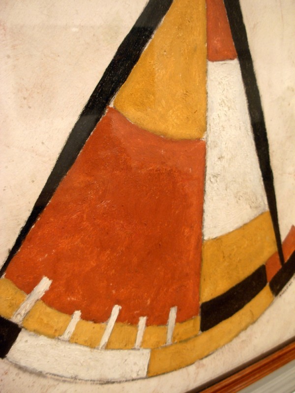
Sextant(c. 1917) by Marsden Hartley. Oil on Panel. Philadelphia Museum of Art. Photo by Wayne Stratz
Another photo from my and Stratoz’s trip to the Philadelphia Art Museum, of Marsden Hartley’s Sextant. I knew Hartley’s name, but as as poet, not a painter, from my days of writing poetry and going to school for an MFA. The sextant reminded me of Stratoz’s drafting tools, many of which came from his father, a draftsman(who learned Autocad in his 60’s so he could keep working), especially the compass. Both a sextant and a compass have a moveable limb, and can measure angles, though sextants are for navigation, and compasses for drawing, but both are a way of finding our way and knowing the world. Stratoz made a video of his doodling, which starts with a compass. His stained glass arose from a desire to take his doodles and incarnate them in glass. I love watching Stratoz draw, as he spins the paper, and the lines blossom.
Here is a poem by Marsden Hartley, which originally appeared in Harriet Monroe, ed. (1860–1936). Poetry: A Magazine of Verse, 1920.
Stratoz was pleased to discover someone purchased his Scraps of Faithfulness Mandala from our Nutmeg Designs Etsy shop, that he created, with bits of glass from our Fruit of The Spirit commission. I find it fascinating how our mosaic mandalas have a different flow with his larger pieces, and yet look akin to each other.
Sheila Hicks. American,1934- Zapallar, 1957-58 wool 9 1/4″ x 4 3/4″ Private collection Photograph by: Bastiaan van den Berg
I have a fondness for orange combined with pink. Pink is not my favorite color, so there must be something about orange that transforms it for me!
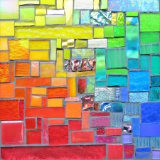
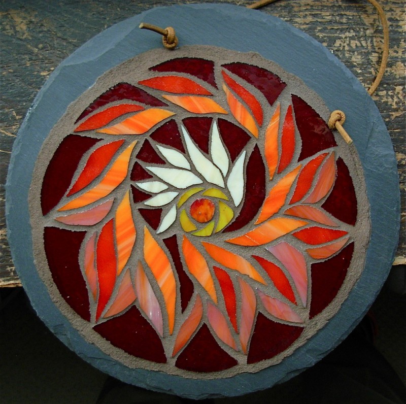
Chinese Coins Quilt Pattern in Mosaic by Margaret Almon
“Textiles had been relegated to a secondary role in our society, to a material that was either functional or decorative. I wanted to give it another status and show what an artist can do with these incredible materials.”
Sheila Hicks. Sumo Balls. Photo: Massimo Vignelli AssociatesSilky Rainforest. Sheila Hicks. Renwick Museum of Craft. Photo by Wayne Stratz.
I first saw a piece by Sheila Hicks while on vacation to DC, and the colors were mesmerizing. It turns out she studied with painter Josef Albers at Yale, who was influential in color theory, and was friends with Anni Albers, fiber artist, and then she won a Fulbright to Chile to study weaving, and fiber and color became the essentials of her vision. The Mint Museum of Craft & Design is hosting the exhibit Sheila Hicks: Fifty Years, until January 29, 2012. I am also smitten that The Mint Museum has a Wiki created by their Library staff, with information about exhibits, which appeals to my librarian self.
What colors are transformed for you when put together?
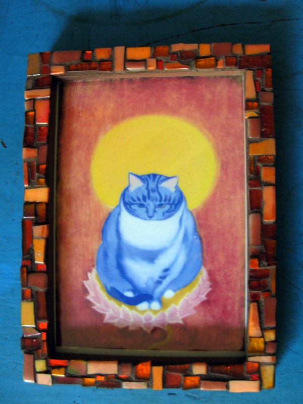
I had my first interview on video, with Rachel of Square Peg Artery and Salvage in Philadelphia. We filmed in my studio, and Rachel had a calming effect on me, since being videotaped made me nervous. Rachel asked me what artists I would tell others to “google” and why. One of the artists that I mention in the interview is Ivan Chan, and a print of his fingerpainting “Here Kitty” watches over my studio and glimpses of it are in the video. The colors in Ivan’s art are full of spirit and intensity, and his tagline is “Invite Beauty” which I love as a motto to live by. Ivan has been going through the process of becoming a therapist, and I believe he will be a fine one, with his eye for beauty in life, and powers of observation. I made a frame for this Kitty icon, which Ivan describes as an awakened being, a Buddha disguised as a cat, in all my favorite orange glass to catch the light.
Watching the Square Peg interview was uncomfortable for me, since I feel awkward being on camera, but I was honored to have the chance to share my art and my creative passions, and support Square Peg, which has been a great supporter of my work. What artists would you tell others to look up on google?
Every year, Stratoz goes on a 8 day silent retreat at Wernersville Jesuit Center in Wernersville, PA. He comes back renewed, and full of design ideas, like this Wernersville Wave. When he was at his monthly spiritual direction group at the Gywnedd Quaker Meeting, and the leader asked the participants what their spiritual landscape was, and this is what Stratoz wrote about the experience, “I wanted to come home from the retreat with mandala designs. I am not sure how many I will get to, but am so glad that I was in the midst of making this when I was asked about my landscape. The Wernersville Wave is here. I am upon it. “(From his blog) What a beautiful manifestation in glass of what is in my husband’s spirit!
I’ve been wondering what the landscape of my spirituality is. I’m drawn to rainbows, to the transitions between colors, how the inbetween places can be beautiful, even if I’m not “already there.” I used to go on a lot of retreats. I signed up for one, thinking it would be good for me, and then realized that what I really needed was to be alone, in my studio, making art, and so that’s what I did. My spiritual landscape looks very much like my studio, a kind of controlled chaos, with mosaics in various stages, bits of glass all over the table, and the floor, in flux, but ultimately, creative.
Genten 403 by Diane Cooper. 12x12x4″, cord, wood, canvas, paint
My love of orange has been aided and abetted by discovering Pinterest. Pinterest is based on the visual, on images, colors, and occasionally words, but often in artistic typefaces and illuminations. I started a Pin Board for Orange Tuesdays, and the amount of orange flowing by has been awesome. One of my favorite pinners is Sondra at Contemporary Cloth, and she pinned a photo of art by Diane Cooper, Genten 403, which reminded me of the medicine bundle I had as a girl. A friend of my parents helped me make one. I don’t know how this came about. It was the 1970’s, in Alberta, where the sacred tradition of the Blackfeet of the Great Plains somehow filtered into my mother’s sewing room. I remember collecting objects to put in the piece of fabric, and once bundled up, I thought of it often, imagining the contents, longing to open it back up again. The two items I still remember are a carved ivory earring(which must have lost its mate), a piece of polished red jasper.
Genten 282 by Diane Cooper. 12x12x3″, wood, fabric, tape.
Diane Cooper is a Chicago artist who makes “Wall Constructions” out of the Genten pieces, which are mosaic-like, as the parts create a new whole. I am drawn to her artist statement, and philosophy:
Living in Japan, a culture much older than
our own, developed within me a love for the
aged and worn surface. The Japanese aesthetic
has been a major influence on my work.
This work embodies the concept of seeing beauty
in life’s detritus. Materials consisting of used bits
and pieces of everyday life, including wood,
leather, fiber and metal are often used in
the condition in which they are found.
My style of working is intuitive. Each piece takes
Its inspiration from the material with which I have
chosen to work.
In a final bit of delight, when I clicked on Diane Cooper’s contact form, this photo came up of her in her studio, which looks like a playground of art! Where do you play? Where do you find beauty?
Orange and Copper Patchwork Mosaic Tile by Margaret Almon.
Fall is my favorite season, in part because there’s so much orange in the landscape. I finished this Orange and Copper Patchwork Tile, and was happy to finally find a use for a couple strips of fusible glass in a cool leopard-like pattern that a friend gave me when I first started making mosaics. It’s always been a challenge for me to use something I really love, as if saving it in a drawer is safer than risking ruining it, but making art has helped me see the joy in using what delights my eye, and it’s worth the risk. Making my patchworks feels like a special treat, as I get out dishes and dishes of tesserae, and improvise.
In my quest to find other “dynamic duo” creative couples, I found the British Lucienne and Robin Day. Lucienne Day(1917-2010) designed fabrics the middle of the 20th Century inspired by plant forms, brilliant color, and modern art from artists such as Paul Klee and Joan Miro. Her husband Robin was a furniture designer, and though they shared a studio, they worked independently. There is a plethora of articles about how Day’s textile is more than “mere fabric” and reads like a painting rather than a textile, and that if it had been painting, she would’ve been more recognized, but Blake Gopnik does concede that Klee may have been influenced by textiles, with his designs covering the whole visual field, edge to edge. My eye loves textiles, and I don’t see them as lacking in art. I love that Day’s work is embraces abstraction. Textile and quilt design is one of my greatest inspirations for my mosaics. Textiles are art. Women are artists. What encouraging thoughts.
Robin and Lucienne Day
Note: These sneakers are more fabulous than I can even say!