Home » Orange Tuesdays » Page 7

Category: Orange Tuesdays

Miyabi Quilt by Matsuko Shiraishi

Miyabi Quilt by Matsuko Shiraishi: Elegance in Orange

Miyabi Quilt by Matsuko Shiraishi
Miyabi Quilt by Matsuko Shiraishi at the Pennsylvania National Quilt Extravaganza, 2014. Photo by Wayne Stratz.

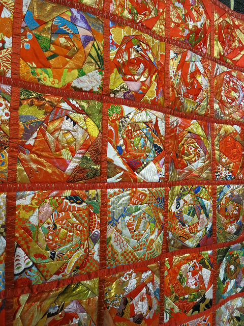
This quilt introduced me to the concept of Miyabi, a traditional Japanese aesthetic combining elegance and sorrow.  Matsuko Shiraishi describes how the quilt is made of wedding Kimono fabric, and that wedding ceremonies are a combination of those two emotions.  To see the whole quilt, which takes on the shape of a Kimono, there’s a great photo of Matsuko Shiraishi’s work on the gladiquilts site.

Having words to describe different forms of beauty helps me look at things more closely and contemplatively.  I have written about Wabi Sabi and Hozho, and the beauty of imperfection,  but Miyabi was new to me.  The Kimono fabric is definitely elegant, with metallic thread and a silky sheen.

What defines elegant for you?

Out of the Crayon Box: Clothing for the Body and Soul by Rachel Clark

Out of the Crayon Box by Rachel Clark
Out of the Crayon Box by Rachel Clark. Pennsylvania National Quilt Extravaganza 2014. Photo by Wayne Stratz.

I just love color and when I say I love color it’s not about that I just love bright colors. I just love color. I’ve had a really fun time in the last year, two years, working with beige and just exploring and playing around with the properties in the colors of beige, the different beiges, so I just like colors and so I tend to work with a lot of colors.

Interview with Rachel Clark, Quilt Alliance 1999. [Edited to add: Quilt Alliance reorganized their site and I now could only find one snippet of the interview with Rachel Clark]


Stratoz and I satiated our quilt sense at the Pennsylvania National Quilt Extravaganza 2014.  This special exhibit, out of the Crayon Box, by Rachel Clark was like a dream closet, a space of color clothing the body and soul.  That last phrase is her tagline and it is wonderful. The opening quote is from an interview with Rachel Clark, and she articulated something that I have experienced – a love of color, not just bright colors.  I love playing with colors in all their forms.

Contemplative Photography at the Michener Museum

Powell Door Detail
Phillip Lloyd Powell Door Detail at the Michener Museum. Photo by Wayne Stratz.
Powell Door
Phillip Lloyd Powell Door at the Michener Museum. Photo by Wayne Stratz.

Stratoz discovered that the Michener Museum now allows photos of their collection.  This is one of our favorite museums and we often wanted to photograph inside.  When I wrote about the Phillip Lloyd Powell door, the Michener graciously provided a photo for me to use, but the pleasure now is in choosing details and angles.

There is a meditative practice called Lectio Divina, reading aloud and letting images and words resonate.  When I look at photographs from a museum trip, it is like Divine Photography, where I continue the process of seeing and contemplating.

The door was open on this latest visit, unlike the stock photo where the door is closed.   What a delight to focus on the hidden parts, the door tucked behind the wall, with its single knob.

House Number 205 in Yellow and Orange by Nutmeg Designs

Being Present in the Studio

House Number 205 in Yellow and Orange by Nutmeg Designs

In reflecting on the evolution of Nutmeg Designs house numbers, I am taken with how they have taken on a life of their own. Stratoz and I started collaborating in the studio with words around 2008.  He used his stained glass skills to shape letters that were legible and lovely, and I used my small pieces to create mosaic backgrounds.  A friend suggested we make house numbers.  One suggestion can make a big difference.

Now my friend is starting her own business, and she wonders what it will be: the idea that creates resonance and draws people in.  It is hard in that place of uncertainty, and yet to know then what I know now would’ve scared me too.  Our orders for house numbers tripled in the 2nd quarter of 2014, and in 2009 I didn’t have a way to track orders, or clients, or pacing myself, but I do now.

There were two more orders in my inbox this morning.  If I get ahead of myself, and focus on my narrative of “how will I get this all done?” then my anxiety rises.  But if I go into the studio, and start making, I am fine as I focus on: the beauty of glass, the delight of color, the emerging of a whole from the pieces as I unite them with grout, the happiness of our clients.

Quilt by Carolyn Carson

Flowing Through Orange with a Quilt from Carolyn Carson

Quilt by Carolyn Carson
Quilt by Carolyn Carson at the Pennsylvania National Quilt Extravaganza XX, 2013.  Photo by Wayne Stratz.

Carolyn Carson in her words:

Quilts are my medium of choice because they exemplify women’s work historically. In addition, I incorporate yarn that I have spun from wool and other fibers, also exemplary of women’s traditional work. I believe that utilizing traditional techniques in a contemporary way helps to draw attention to the lives of women. On a more personal level, it gives me a sense of continuity with other women – historically and globally. 


Color Collecting: The Pantone Project

Tangerine Glass Tiles
Tangerine Glass Tiles in the Studio.

I have been on Instagram since 2013, and I started to notice photos matching objects to Pantone Color Postcards.  This is the only card game I would enjoy playing. I ordered the box of 100 Pantone Postcards awhile ago, because I couldn’t resist a box of color, but I couldn’t bring myself to actually send them through the mail.  The Pantone Project, as it is called, gives me a use for my cards.  There is something satisfying about finding something that matches a card, or in finding the right card to match something that has caught my eye.  Of course I started with orange!

In reading about the history of this project, I discovered the artist who began it, Paul Octavious.


Real-World Hues Meet Their Pantone Partners

Ionic Structure of Glass by Dominick Labino

Beauty in the Ionic Structure of Glass by Dominick Labino

Ionic Structure of Glass by Dominick Labino
Ionic Structure of Glass by Dominick Labino(1979), cast and fused glass, 60 inches across, Corning Museum of Glass. Photo by Wayne Stratz(2014).

Our 2014 pilgrimage to Corning Museum of Glass brought us in front of Dominick Labino’s Ionic Structure of Glass, 5 feet across, set into a wall, backlit and glowing like a rose window.  It hasn’t been on display for 15 years, since the first renovation of the Corning Museum.

Labino was an industrial engineer who held 60 patents and loved glass.  Harvey Littleton invited him to the original workshops at the Toledo Museum of Art in 1962, where American Studio Glassmaking began.  Littleton’s furnace wouldn’t melt the glass, and Labino used his scientific and research knowledge to overcome this, as well as learning glass blowing in the process.  The idea of making glass in a craft studio rather than a factory was exciting stuff.  In fabulous fluidity between art and science, Labino retired early from his Vice Presidency of the Johns-Manville Fiber Glass Corporation, and started creating art glass.  He had the chemistry skills to develop his own colors rather than remelting commercially made glass, as he described in his book Visual Art in Glass, and a love of the unlimited possibilities of color in art.


goldfish in Orange: Rene Lalique Vase, Formose (Formosa), 1924

Rene Lalique Vase: Formose (Formosa), 1924

The Lalique exhibit at The Corning Museum of Glass (until January, 4, 2015)is a treasure trove of orange.  Stratoz took this photo of the Formose goldfish vase for me.  The fins flow gracefully together enveloping the surface.  It was made by blowing a gather of hot glass into a mold ~ mold-blown glass.


Great at Eight: Tool Set for a Girl who Wanted to Build

Happy Birthday Card when I turned 8.

On the occasion of celebrating an Orange Tuesday Birthday, I went into the archives for this birthday card with a whimsical orange giraffe.  My mother neatly wrote what my gifts were inside the card.  I don’t remember the dress, but I remember the tool set.

You're 8.  That's Great!
You’re 8. That’s Great!

I found the dollhouse I made with this tool set at age 8.  My father supervised as I hammered together scraps of plywood.  The wallpaper in the kitchen may be a scrap of the wallpaper from our actual kitchen.  The stove is an empty vanilla pudding box.  That is an orange light switch on the right.

Kitchen in the Dollhouse
Kitchen in the Dollhouse of the 1970’s

The wallpaper in the living room came from our neighbor Mrs. Firth.  The loopy orange carpet was found in many parts of our full size house.  Can you tell it was the Seventies?  I created a pastel bookcase and just noticed the row of love poems across the top shelf, which is in counterpoint to the rather forlorn spool person facing the wall.  I feel like interrupted a serious conversation.

Living Room in the Dollhouse of the 1970's
Living Room in the Dollhouse of the 1970’s

I don’t remember playing with dolls inside this house, but only the process of creating the building, and furnishing the rooms. In a journal from grade 3, I describe building a yard for the dollhouse out of Lego. The dollhouse was my world to bring forth.